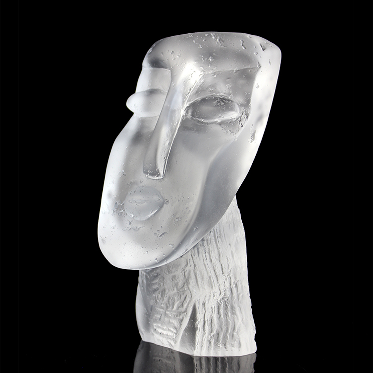
In luxury homes, glass décor works best when scale matches the room, colors echo the light and materials, and finishes fit how the space is used. Large, calm pieces suit living and dining areas, while smaller, tactile objects with softer finishes work better in bedrooms, bathrooms and secondary spaces.
Introduction
Glass décor in a luxury home is never “just an accessory”.
It is one of the few materials that can catch light, echo architecture and quietly signal quality without shouting.
But many designers and homeowners still ask the same questions:
Is this piece too big for the room?
Will this color fight with the rest of the palette?
Will this finish actually survive real life?
This guide looks at glass décor room by room, from the point of view of a studio–factory that spends every day turning ideas into actual objects.
We will focus on three levers you can control in every project: scale, color and finish.
Section 1 – Start with the room’s job, not the object
Before choosing any glass piece, it helps to ask: what does this room need the object to do?
In luxury homes, glass décor usually has one or more roles:
- Anchor a focal point (for example, a console in the entryway)
- Softly connect colors and materials already in the room
- Catch and move light in spaces that feel flat
- Create a quiet, art-like moment in an otherwise functional zone
When the role is clear, decisions about size, color and finish become much easier. A hero console piece has very different requirements from a small object on a bedside table.
Section 2 – Choosing the right scale for each room
Living room
In larger living rooms, glass décor often competes with sofas, art, lighting and views. Pieces that work well here are:
- Medium to large sculptures on consoles, shelves or pedestals
- Pairs or trios of vessels on coffee tables or low units
- One strong statement piece per sightline, instead of many small ones
As a guideline, a hero sculpture near a seating area should be large enough to read clearly from where people sit, but not so large that it feels like another piece of furniture.
Dining room
The dining table and sideboard are the main stages. Here, glass décor needs to respect sightlines and conversation:
- Long tables usually suit low, elongated centerpieces or a row of smaller pieces
- Sideboards can handle taller, bolder sculptures or vessels
- Anything in the middle of the table should not block eye contact when people are seated
Entryway
The entry sets the tone of the whole home. Glass pieces in the entryway can be slightly more dramatic in scale:
- One strong sculpture on a console or pedestal
- A pair of pieces framing a mirror or artwork
- Objects sized to balance with the door height and ceiling, not just the furniture
Bedroom
In bedrooms, scale tends to soften:
- Small to medium pieces on nightstands or dressers
- Objects that feel comfortable to hold in one or two hands
- No oversized forms that feel “loud” next to the bed
Bathroom and dressing area
Space is tighter, but details matter more:
- Small, carefully finished pieces on vanity tops or shelves
- Objects that can live near water and steam without constant worry
- Sizes that do not dominate the basin or clutter the countertop
In all rooms, a simple rule helps: if the glass piece makes the furniture feel strangely small or unstable, the scale is probably off.
Section 3 – Color that works with light, not against it
Luxury interiors are often built on calm palettes: stone, wood, textiles and soft paints. Glass color should sit inside that story, not fight it.
Living and dining areas
- Warm neutrals (tea, smoke, champagne, amber) pair well with wood and stone.
- Deep jewel tones (ink blue, forest green, aubergine) give weight without feeling heavy.
- Clear or lightly tinted glass keeps sightlines open in smaller spaces.
Entry and corridors
These spaces change quickly with daylight and artificial light:
- Slightly stronger color works here, as pieces are seen in passing.
- Layered, two-tone glass can echo both wall and floor colors.
- Avoid extreme neons that might clash with seasonal decorations or flowers.
Bedrooms
In bedrooms, color should support rest:
- Soft, desaturated tones work better than very sharp, high-contrast colors.
- Frosted or satin surfaces in calm greens, blues or smoke feel quieter at night.
- Metallic inclusions can be beautiful, but use them lightly to avoid a “hotel lobby” feel.
Bathrooms
Bathrooms already have a lot of white, chrome and mirrors:
- Cool, clean tones (aqua, pale grey, soft blue) sit well here.
- Clear or lightly tinted glass keeps the space light and open.
- If the bathroom has strong marble veining, choose glass colors that relate to the stone rather than the taps.
Across all rooms, repeating one or two glass colors in different formats often feels more refined than using many different ones.
Section 4 – Finish and texture: how refined should glass feel?
Finish is where glass décor becomes either truly luxurious or slightly ordinary.
High-gloss, crystal-clear
- Works well in formal spaces and bright rooms with good lighting.
- Shows craftsmanship clearly, but also shows dust and fingerprints.
- Best for pieces that are not handled constantly.
Soft satin or frosted
- Diffuses light and hides fingerprints.
- Feels quieter and more “touchable”, especially in bedrooms and bathrooms.
- Works well when combined with one glossy accent or edge.
Textured and bubble effects
- Add visual interest at close range and catch light in layered ways.
- Ideal for smaller pieces that guests hold and examine.
- In very busy interiors, simpler textures can be easier on the eye.
Metallic or luster finishes
- Bring drama and a sense of occasion.
- Best used as an accent within a collection, not across every piece.
- Important to check how they behave under different light temperatures in the home.
For luxury homes, the question is rarely “which finish is best?” but “how do different finishes talk to each other inside one project?”
Section 5 – Matching material to use: liuli glass, crystal-like glass and resin
Not every “glass-looking” object is made from the same material, and in luxury projects this matters.
Liuli-style art glass
- Dense, crystal-like material with rich color depth and weight.
- Ideal for hero pieces on consoles, sideboards and pedestals.
- Communicates craftsmanship and has a strong presence even in large rooms.
Kiln-cast or fused glass forms
- Often used for sculptural shapes and abstract forms.
- Can mix clear and colored areas in one piece.
- Works well where light passes through from the side or back.
Glass-like resin
- Lighter in weight and more impact-resistant.
- Suitable for larger or more complex shapes where glass would be too heavy or fragile.
- Useful in children’s rooms, busy circulation areas or projects with shipping constraints.
The best projects often combine these materials intelligently, while keeping the overall language of color and finish coherent.
Section 6 – Buying checklist: room-by-room questions to ask
When specifying or commissioning glass décor for a luxury home, these questions help keep decisions grounded:
Entryway
- Does this piece balance with the door height and console size?
- Is the color the first thing you see, or does it support the whole scene?
- Will it be safe from strong drafts or accidental bumps?
Living room
- Can you still read the form clearly from main seating positions?
- Does the glass echo any colors in textiles, art or stone?
- Do you have at least one piece that catches light at different times of day?
Dining room
- Can people see each other across the table?
- Is the centerpiece easy to move for different occasions?
- Does the sideboard piece still look composed when the table is empty?
Bedroom
- Would you be comfortable touching this piece every day?
- Does the finish feel calm when lights are dimmed?
- Is the size appropriate for the nightstand or dresser?
Bathroom
- Is the finish practical around water and steam?
- Does the color work with both daylight and artificial light?
- Is cleaning simple, or will tiny crevices trap residue?
These questions are simple, but they reflect many of the conversations we have with designers and homeowners during sampling and development.
FAQ – Common questions about glass décor in luxury homes
Q: How big should a glass sculpture be in a living room?
A: It depends on the room size and sightlines, but as a rule, a hero piece should be clearly visible from main seating positions without feeling heavier than the furniture it sits on. Medium to large pieces on consoles or sideboards often work best.
Q: Which glass colors feel timeless in luxury interiors?
A: Clear glass, warm neutrals such as tea, smoke and champagne, and deep jewel tones like ink blue and forest green tend to age well across different trends. They integrate easily with stone, wood and soft furnishings.
Q: Are glossy finishes or frosted finishes better for luxury homes?
A: Both can work. High-gloss finishes show craftsmanship and light, but also reveal fingerprints. Frosted or satin finishes feel softer and are easier to live with in bedrooms and bathrooms. Many successful projects combine both.
Q: When is glass-like resin a better choice than glass?
A: Resin is helpful for larger, more complex forms, in locations where impact resistance is important, or when shipping weight is a concern. For smaller hero pieces where weight and cool touch are part of the experience, glass or liuli-style glass is usually preferred.
Q: How many glass pieces should be in one room?
A: In luxury homes, fewer, better-chosen pieces nearly always feel more refined. One or two strong moments per room, plus a few smaller supporting objects, normally look better than many unrelated items.
Structured Facts for Specifiers and Buyers
Topic: Glass décor for luxury homes by room
Key Insight: Scale, color and finish must follow the room’s function, light and furniture, not just the object’s beauty.
Rooms Covered: Entryway, living room, dining room, bedroom, bathroom, dressing area
Preferred Colors: Clear glass, warm neutrals, calm jewel tones, soft desaturated shades
Recommended Finishes: Mix of gloss and satin, with selected texture or metallic accents
Material Options: Liuli-style art glass, kiln-cast glass, glass-like resin
Use Cases: Focal points, light-catching accents, quiet bedside details, bathroom art moments
Design Priorities: Proportion, sightlines, tactile comfort, ease of cleaning, safety
Project Support: Concept translation, sampling, material mix advice, packing for installation
Conclusion
In luxury homes, glass décor is one of the rare tools that can change a space with almost no construction work.
The right piece, at the right size, in the right color and finish, can pull a room together in a way that fabrics or paint alone cannot.
By thinking room by room and asking simple, practical questions about scale, light and use, designers and homeowners can choose glass pieces that feel as if they were designed with the architecture, not added afterwards.
For teams who want to explore liuli-style art glass, crystal-like objects or glass-like resin pieces across different rooms, working directly with a studio–factory partner makes it easier to keep the language coherent from entryway to bedroom.